
Understanding workplace safety is both an art and a science; safety colors play a crucial role. These colors go beyond decoration and serve as important indicators that guide workers through safety protocols and potential hazards, creating a safer and more informed workspace.
In this blog, we thoroughly examine the safety color palette, explaining the meaning behind each shade and highlighting their important roles. Whether you’re an experienced expert looking for a review or a beginner wanting to learn more, this guide will provide the knowledge to accurately interpret these essential visual signals. Join us as we vividly illustrate the concept of safety, color by color.
What are Safety Colors?
Safety colors are standardized in workplaces and other environments to quickly convey specific information about hazards, directions, or actions. These colors are visual markers on machines, signs, labels, or other objects to indicate potential risks or guidelines. This ensures that individuals can easily and swiftly recognize and respond to potential dangers or instructions.
Importance Of Safety Colors
The importance of safety colors cannot be overstated, especially in environments where hazards exist, or specific actions are required for the safety and well-being of individuals. Here are some key reasons why safety colors are crucial:
- Instant Recognition: Safety colors provide immediate visual cues. For instance, when someone sees a red sign, they instinctively know to stop or be cautious, even before reading any accompanying text.
- Consistency Across Industries: Standardized safety colors ensure that regardless of where you are or your industry, the colors will always signify the same warnings or messages. This uniformity is vital for workers who may switch job locations or sectors.
- Reduction of Accidents: When hazards or safety equipment are clearly marked with universally recognized colors, it can significantly reduce the risk of accidents or mishaps.
- Efficient Communication: In fast-paced or noisy environments where verbal communication might be challenging, color-coded signs can convey critical messages quickly and effectively.
- Compliance with Regulations: Many governmental and industry-specific regulations require standardized safety colors to ensure a baseline level of safety is maintained across different workplaces.
- Enhanced Visibility: Bright safety colors like neon yellow or reflective materials are especially visible, even in low light conditions, ensuring that safety warnings or equipment can be easily spotted.
- Aids in Training: When training new employees, having a standardized color system helps teach them about workplace hazards and safety protocols more efficiently.
- Promotes a Safety Culture: The consistent use of safety colors indicates an organization’s commitment to maintaining a safe environment. This can foster a culture where safety is prioritized, and employees are more vigilant.
- Quick Response in Emergencies: In emergencies, every second counts. Clear color indicators, such as green for emergency exits or red for fire equipment, can expedite response times, potentially saving lives.
- Cost-Effective: While the initial implementation might require an investment, in the long run, safety colors can save organizations money by reducing the number of accidents, potential legal liabilities, and downtime.
Safety colors are pivotal in ensuring that workplaces are safe, efficient, and compliant with necessary regulations. Their universal nature means that individuals can understand and act upon safety warnings or instructions, regardless of language or cultural barriers.
Safety Colors at Work and Their Meanings
Safety colors are commonly used in workplaces to alert employees and visitors to various hazards or to convey important information. Using standardized colors ensures that people understand the associated risks and act accordingly. The Occupational Safety and Health Administration (OSHA) in the United States and various international standards have set guidelines for these colors. Here’s a list of common safety colors and their general meanings:
1. Red
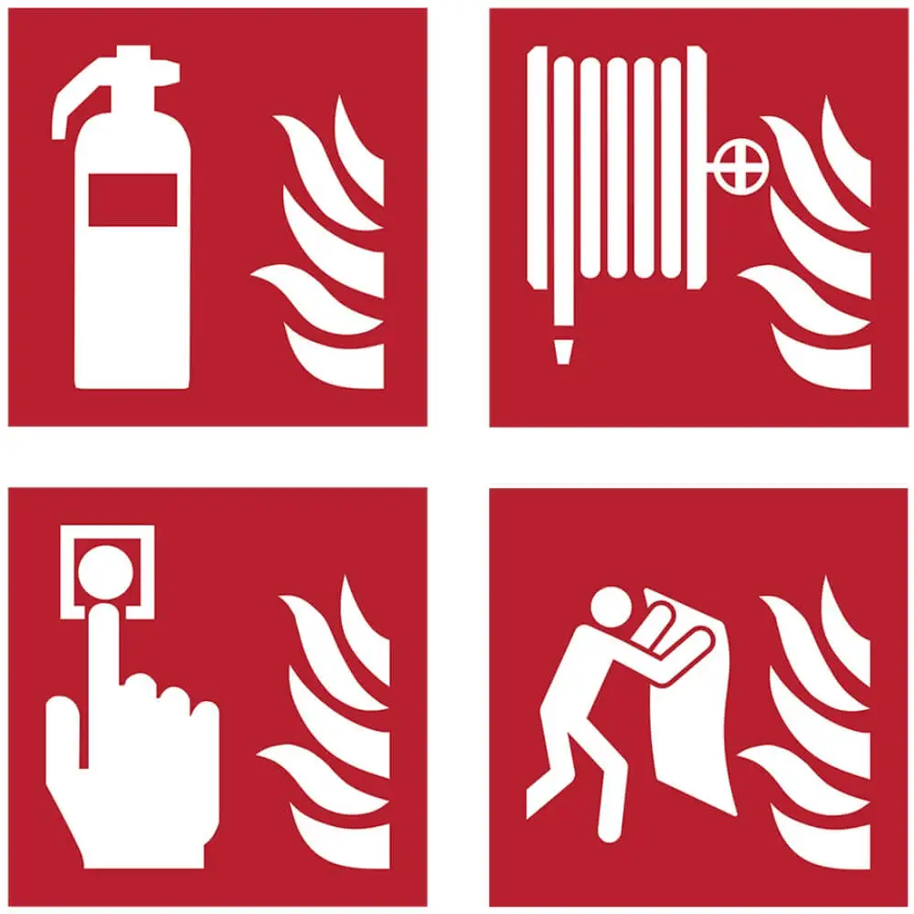
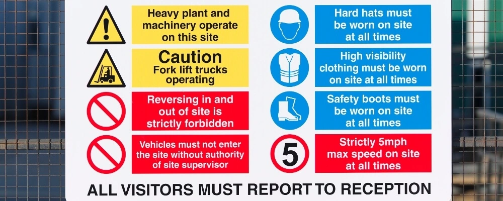
Red is universally recognized as a sign of danger or an order to halt. Its visibility is crucial in situations of imminent danger. Items associated with fire safety, such as fire extinguishers, fire hoses, or fire alarm call points, are usually red to ensure they stand out. Similarly, red is employed on buttons or switches designed to stop machinery or processes immediately. This ensures that workers can quickly identify and use them in emergencies. Moreover, red is commonly found on signs that prohibit specific actions, indicating areas or actions like “No Entry” or “Do Not Touch.”

2. Orange
While still a warning color, orange is slightly less urgent than red. It serves to highlight potential dangers and advises caution. Many machines with parts that move, which may trap or crush, are marked with orange. Temporary hazards like those in construction zones might also utilize orange markers. Furthermore, orange is often used to delineate edges that pose a fall hazard or should not be crossed.
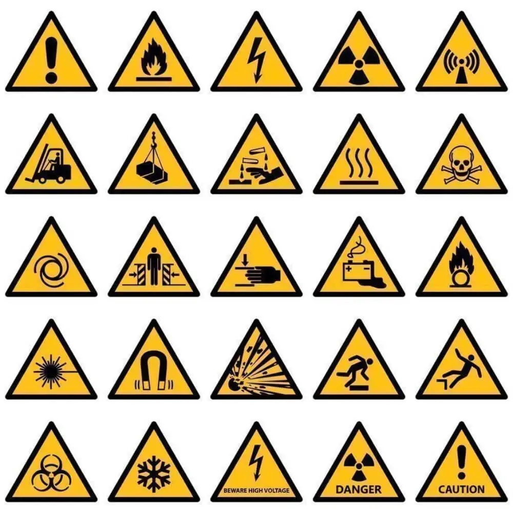
3. Yellow
Yellow is synonymous with caution. It alerts workers to hazards that, while not immediately life-threatening, still require attention. Typical applications of yellow in safety contexts include “Wet Floor” signs to indicate slip hazards or areas or containers marking the storage of potentially harmful chemicals. In addition, yellow might be used to demarcate areas that should be kept clear or designate paths for walking to prevent conflicts with vehicle traffic or other operational procedures.
4. Green
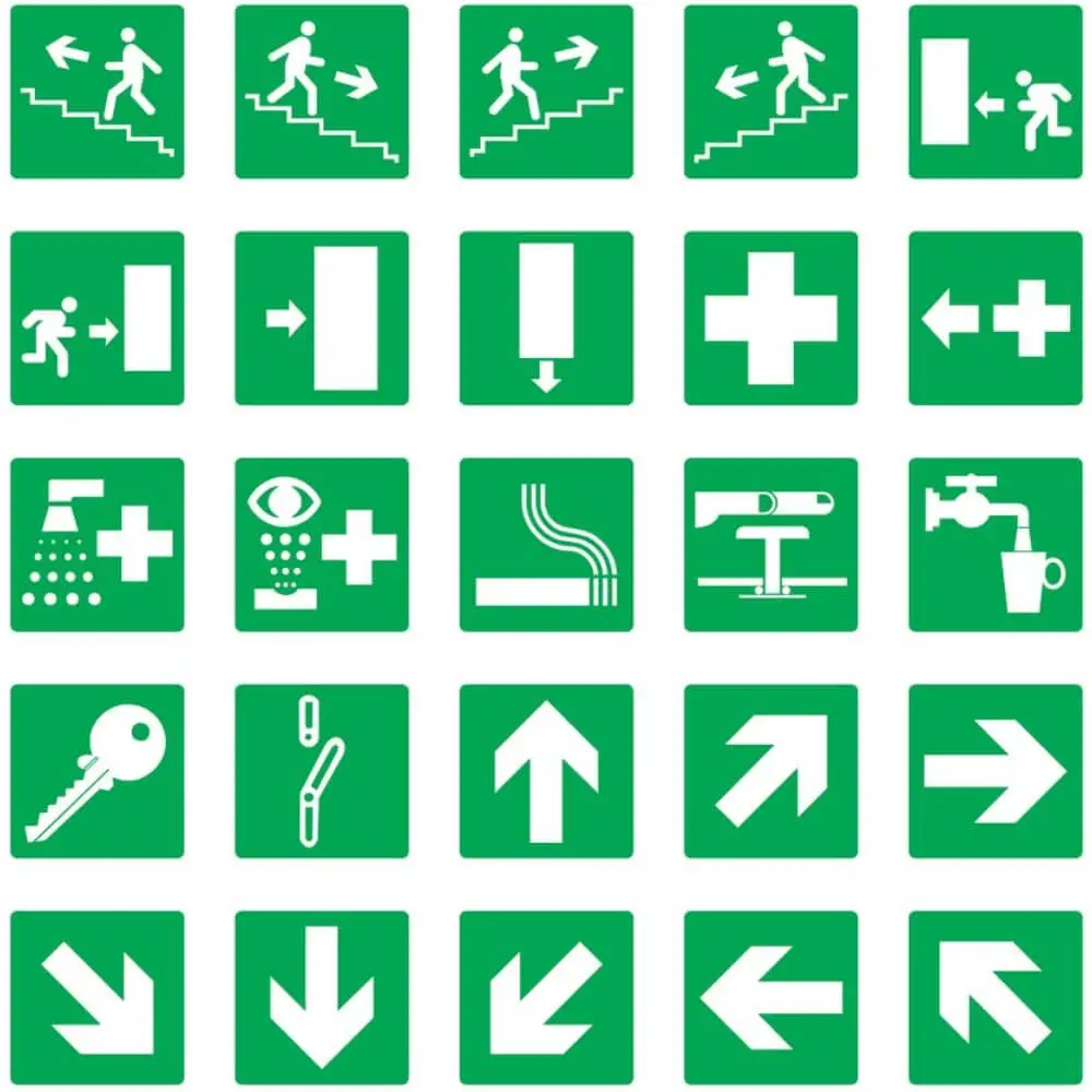
Contrary to the warning nature of the colors above, green indicates safety. Items or locations marked in green usually have safety in mind. For instance, first aid stations or boxes are often green, ensuring rapid identification during emergencies. Emergency exits, escape routes, or gathering points during evacuations might also be highlighted in green. Beyond these, other safety-related equipment, like eyewash stations, safety showers, or breathing apparatus, might be stored or located in areas signified with the color green.

5. Blue
Blue is primarily linked with the conveyance of information, guiding behavior rather than warning of direct hazards. Blue signs or markings in workplace safety might signify mandatory requirements or instructions. For instance, a blue sign might dictate that safety goggles must be worn past a certain point. It’s a color that provides directives. Further, blue is sometimes used to denote areas reserved for specific purposes or personnel — think “Employees Only” signs or zones allocated for certain tasks or operations. The essence of blue in this context is guidance, ensuring that individuals understand expected actions or behaviors in specific settings.
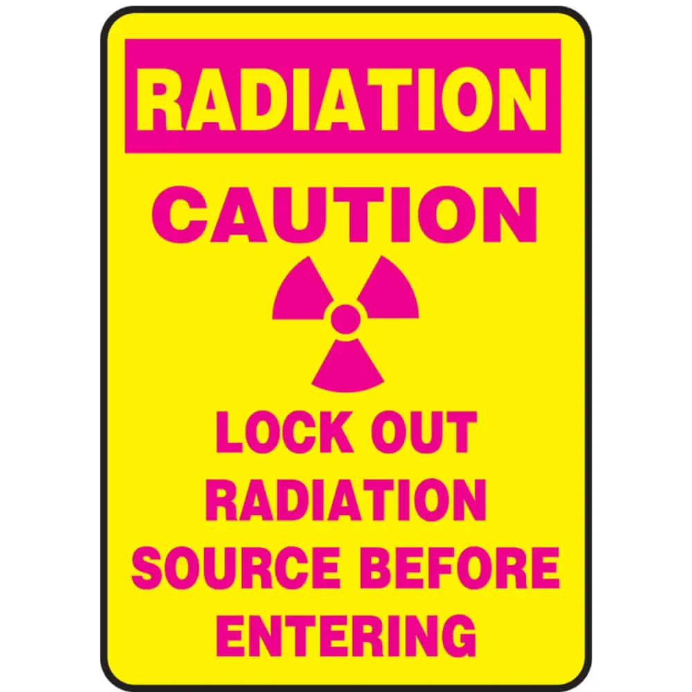
6. Purple
Purple is not a universally standardized safety color but has, over time, been associated with radiation or radiation hazards in some industries and contexts. While the nature of radiation can be imperceptible, its potential harms are well-documented. The use of purple acts as a visual cue in environments where radiation might be present, urging caution and the use of appropriate protective measures. In such settings, workers trained to recognize the significance of purple might adjust their actions, ensure they’re adequately shielded, or avoid particular areas altogether.
7. Black & White
The combination of black and white is clear, contrasting, and immediately recognizable, making it ideal for demarcation and guidance. In industrial settings, black and white stripes or patterns might mark boundaries, differentiating pedestrian pathways from vehicular lanes or denoting zones that need to be obstructed. Think of areas around fire equipment, which should be kept clear for easy access. In other contexts, black and white might be used for basic workplace housekeeping signs, indicating storage areas or places for specific tools or equipment.
8. Gray
As of the current guidelines, gray doesn’t have an explicitly defined safety purpose, but its reservation by ANSI indicates a potential for future applications. Such reservations are important as they allow for the incorporation of new safety standards or the address of emerging hazards without causing confusion with existing color-coded protocols. Gray remains a color of potential, awaiting a role in the ever-evolving realm of safety standards.
Different Safety Color Standards
Different safety color standards have been established by various organizations to ensure the protection and well-being of workers across different industries. Each of these standards plays a crucial role in communicating hazards, offering information, and guiding behavior in specific scenarios.
ANSI Safety Color Standards:
The American National Standards Institute (ANSI) is revered for its comprehensive guidelines on safety colors. Even though it’s not a governmental entity, its standards are widely adopted across the U.S. and many parts of the world. According to ANSI, red denotes immediate danger and is used for stop signals. Orange is a warning color, often linked to machinery with potential hazards. Yellow suggests caution, green represents safety, and blue provides general information. Purple, though not officially designated, has come to symbolize radiation hazards. The combination of black and white usually signifies directionality and boundaries, while gray remains reserved for future safety applications.
OSHA Safety Color Standards:
The Occupational Safety and Health Administration (OSHA), a government agency, focuses on physical hazards in the workplace with its color system. Red, under OSHA, highlights immediate danger, such as fire hazards or stop signals on machinery. Yellow is designated for cautionary purposes, warning workers of physical hazards they might encounter, like tripping or falling.
International Safety Color Standards:
Beyond the U.S., other standards come into play, notably from the International Organization for Standardization (ISO). These standards are prevalent in many countries, ensuring consistency in safety understanding across borders. For instance, ISO uses red for fire protection equipment, yellow for chemical risks, and green to indicate emergency exits or escape routes.
Industry-Specific Standards:
Some industries have unique safety color codes due to their specific operational needs. For instance, the maritime, aviation, and military sectors have distinct color codes tailored to their unique environments and challenges.
In essence, regardless of which standard is applied, the primary objective of these safety colors is clear communication. Proper understanding and adherence to these color codes can significantly reduce workplace accidents and protect the well-being of workers.
Where Should Safety Colors Be Used?
Safety colors are vital visual cues in various environments to convey information, warn of hazards, and guide behaviors. Their proper placement is crucial for ensuring safety and compliance. Here are areas and scenarios where safety colors should be used:
- Machinery and Equipment: Orange or other warning colors are used on machinery to indicate moving parts or potentially dangerous areas. Red might highlight emergency stop buttons. Blue can indicate informational notes about the machinery’s operation.
- Workplace Floor Markings: Colors like yellow denote walkways or paths that should remain clear, while white might be used for general demarcation. Black and white stripes, on the other hand, can indicate areas that present physical or health risks.
- Safety Equipment Locations: Green shows where first-aid kits, eyewash stations, and safety showers are located, ensuring quick emergency access.
- Emergency Exits and Routes: Green is the standard color for marking emergencies and escape routes. These markings guide individuals safely out of a building during emergencies.
- Fire Protection Equipment: Red is reserved for fire-related hazards and equipment. Fire extinguishers, fire hose cabinets, and fire alarms are typically marked in red.
- Storage Areas: Chemical storage areas, particularly those with hazardous substances, should be marked with appropriate colors, often yellow. This alerts workers to the potential dangers and reminds them to handle substances carefully.
- Barriers and Temporary Areas: Yellow tape or barriers can indicate temporary hazards, such as wet floors or construction zones.
- Traffic Lanes: In facilities where vehicles or heavy machinery operate alongside pedestrians, clear demarcations using black and white or yellow can guide traffic, ensuring safety.
- Radiation Areas: Purple, although not officially designated in some standards, has come to be used to indicate areas with potential radiation hazards.
- Boundaries and Restricted Areas: Blue, black, and white can mark areas off-limits to unauthorized personnel or guide people in the right direction.
- Waste and Disposal: Color-coded bins, such as blue for recyclables or yellow for biohazard waste, can guide proper disposal.
- Instructional Signage: Blue signs can relay important information or instructions in specific areas, providing clarity for workers.
Incorporating these colors in the correct workplace areas helps create a safer environment, ensuring that hazards are clearly marked, and guidance is easy to follow. Proper training and regular reminders about what these colors signify can further bolster workplace safety.

Implementing Safety Colors Effectively
Implementing safety colors effectively is a crucial aspect of workplace safety. When done correctly, employees can quickly identify hazards, find emergency equipment, and navigate their environment safely. Here’s how to effectively implement safety colors:
- Assessment and Planning: Conduct a thorough risk assessment of the workspace before implementing any safety color coding. Identify areas of concern, potential hazards, and equipment that require marking.
- Consistency: Regardless of the specific standards being followed, consistency is paramount. If a color represents a specific hazard or action in one area, it should represent the same thing everywhere in the workplace.
- Training: Simply marking areas or items with color isn’t enough. Employees must understand what each color means. Regular training sessions should be conducted to familiarize and update staff with safety color codes and their implications.
- Visibility: Ensure that color-coded signs, markings, and labels are visible. Consider the lighting in the area and the background against which colors will be placed. They should be easy to see and recognize from a distance.
- Maintenance: Over time, color markings can fade, peel, or become obscured. Regularly inspect all color-coded items and areas to ensure they remain clear and visible. Replace or refresh any markings that have deteriorated.
- Integration with Other Safety Measures: Safety colors should complement other safety measures, such as signage with text descriptions, pictograms, or auditory alarms.
- Avoid Overloading: While marking hazards is essential, it’s equally important not to overload spaces with too many signs or colors, which can lead to confusion or “sign blindness.”
- Feedback Mechanism: Encourage employees to provide feedback on the effectiveness of the color-coded safety measures. They might notice areas where additional markings are needed or where current markings might be confusing.
- Regular Updates: The safety color coding system might need updates as the workspace evolves – with new equipment added, processes changed, or repurposed areas. Regularly review and adjust the system to reflect these changes.
- External Communication: If you have visitors, vendors, or clients frequenting your workspace, consider having a brief orientation or guide that explains the safety color system in use. This ensures that even non-regular inhabitants of the space understand the safety cues.
- Accessibility Considerations: Consider employees with visual impairments or color blindness when implementing safety colors. This might mean integrating patterns or text alongside colors or considering alternative means of conveying safety information.
- Utilize Standard Practices: Adhering to recognized standards like ANSI or OSHA can make the implementation process smoother and more universally understandable, even if not mandated.
Implementing safety colors requires strategic planning, consistent application, employee training, and regular maintenance. When done effectively, it fosters a safer work environment, reduces accidents, and promotes a safety culture.
Conclusion
Understanding the diverse safety colors in the workplace is more than just adhering to standards; it’s about prioritizing human life and well-being. The palette of safety hues, from cautionary yellows to informational blues, speaks a universal language of protection. As industries evolve and workplaces change, the significance of these colors remains constant, underscoring the timeless essence of safety. Let’s not merely see these colors but truly recognize their value, ensuring a safer work environment.